
21/11/2023
23/02/2023
05/08/2022
08/06/2022
01/11/2021
05/07/2021
20/01/2021
15/08/2020
12/05/2020
01/07/2019
04/05/2019
22/11/2018
17/01/2018
10/10/2017
25/11/2016
02/09/2016
16/07/2016
24/01/2016
05/12/2015
03/09/2015
05/01/2015
23/11/2014
26/10/2014
22/10/2014
28/08/2014
10/08/2014
17/06/2014
09/03/2014
26/01/2014
16/09/2013
04/08/2013
08/05/2013
15/04/2013
09/11/2012
06/06/2012
12/03/2012
07/10/2011
01/07/2011
26/04/2011
07/04/2011
14/03/2011
07/02/2011
08/01/2011
15/12/2010
15/10/2010
03/10/2010
16/07/2010
18/05/2010
02/05/2010
24/04/2010
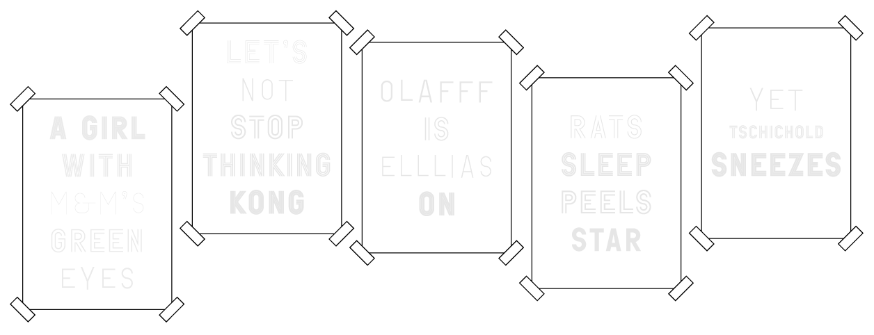
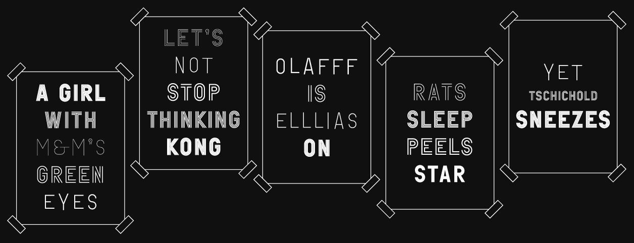
Five Prints
conceived and printed in phosphorescent ink as editions of 13 by S/F (Auckland, New Zealand).
Five Prints by RP, are printed as editions of 13 in phosphorescent ink. Word sequences are set in the typeface Boymans designed in 2003 as part of the identity developed by Mevis & Van Deursen for the Boijmans van Beuningen Museum in Rotterdam, the Netherlands. The typeface is loosely based on Lance Wyman’s multi-layered identity design for the 1968 Mexico City Olympics. In Wymans font, the repeated outlines of the individual characters referred to motifs in Mexican folk art, transformed and used for the Boymans typeface they are a metaphor for the museums new wrap-around building and the curatorial structures expressed by this architecture. Designed by RP in ten weights, each font consists of three versions: single, double and triple lines. When combined, layered or coloured the typeface generates endless variations.
Split/Fountain is a project space, publishing venture and bookshop founded by Narrow Gauge and Michael Lett. S/F is open Friday and Saturday from 12–5 pm or by appointment.
Purchase copies here.
04/04/2010
30/01/2010
05/01/2010